
MCLEAN, VA, July 26, 2020 — We are excited to announce our new company logo and website as part of the evolution of our brand. Over the past few years, we have made tremendous progress on all fronts. From expanding our team to developing new capabilities to building new partnerships, we continue to make great strides. The new Easy Dynamics brand identity with a redesigned logo and website aims to communicate this evolution.
New look, same us.
Although our external appearance has changed, we have not. Our commitment to our clients remains our primary focus as we continue to be a dedicated and trusted partner for our clients.
So, why the new look?
Since our inception, Easy Dynamics has continued to evolve within and adapt to an ever-changing technology environment. The old logo was launched over a decade ago when we were predominately a SharePoint company. Since then, Easy Dynamics has transformed into a next-generation consulting and integration firm delivering cybersecurity, cloud computing, and information sharing services. We have added exceptional team members who have contributed tremendously to our growth and made Easy Dynamics a more enjoyable place to work.
Ultimately, our growth journey led us to reassess our brand identity. We soon realized that the old Easy Dynamics logo and website no longer reflected who we are as an organization today, and thus it was time for a change.
Our new direction.
Our new look was designed to reflect who we are today and to symbolize our dynamic future while staying true to our roots. We conducted in-depth assessments with internal and external sources to capture the true essence of the Easy Dynamics brand. Our efforts revealed that two themes emerged as key elements of our brand – the integrity of the company’s solutions and the passion we have for our work. We incorporated these themes into our new logo.
The new design.
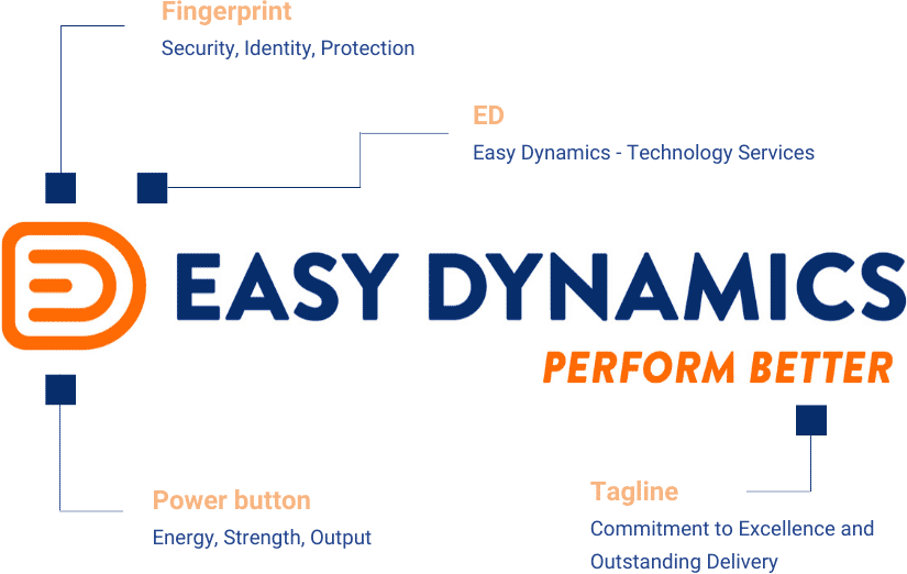
We adhered to orange as our original corporate color and added blue as a new color element to the Easy Dynamics brand. The orange color in our logo represents a bold, dynamic us, and the enthusiasm we have for our work. Blue represents the stability and professionalism we bring to the table. Both colors combined stand for our commitment to excellence and our enthusiasm to strive for continuous improvement and innovation.
The logo mark weaves together three elements of our brand:
- Easy Dynamics – the name of our company in a shade of navy blue;
- A power button – representing the energy, strength, and output we bring to the table; and
- Lastly, a fingerprint – representing our services around digital identity, security, and protection.
The tagline PERFORM BETTER sums up our purpose of always raising the bar and providing our clients with the highest standard of work possible.
All in all, we believe the new look better matches what we have become over the years and where we are going while still staying true to our roots. Our new logo can now be seen everywhere we are out in public, like our website, Facebook, Twitter, LinkedIn, and YouTube page. We would also love to hear from you. Drop us a comment on our social platforms or contact us with any feedback on our new look.